More materials are added after this section.
Logo Portuguese
The SUOMI FINLAND logo is composed of the SUOMI title arranged in two lines in two languages: the SUOMI one, and another language. This RGB version of the logo is intended for digital applications: the web, videos, screens, etc. Each logo is constrained by a defined rectangle that holds its proportion, regardless of scale.
The third party using the Suomi Finland logo shall not give the impression that it has given the authority to act as the representative of the Government of Finland. Third party use of the Suomi Finland logo does not imply affiliation with or endorsement by the Content Providers and the Government of Finland. The Government of Finland at its sole discretion reserves the right, to screen and to remove from use any content it deems inappropriate.
Downloads
Edited: 19.5.2016
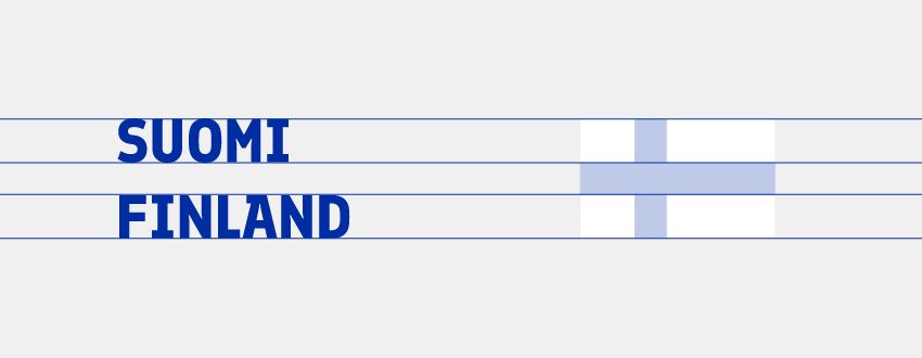
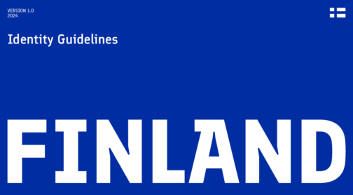
Proportions
The logotype takes its proportions from the flag. When used together – the logo and the flag should always be used in the same proportions. Ready-made logotype originals have been produced to support consistency and ease of use.
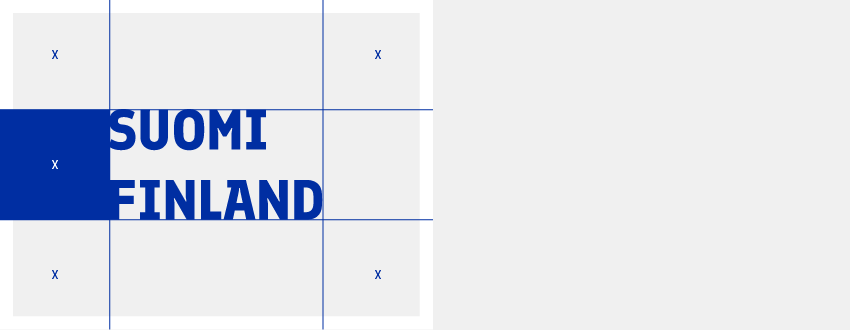
Clear Space
A significant amount of clear space around the logotype is required. This adds visual impact by isolating it from other content and from the edges of the surface it’s placed within.
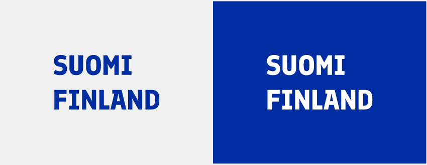
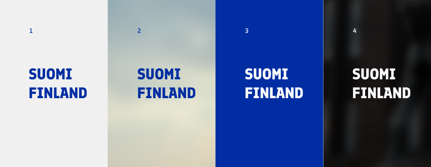
Color Versions
Each logotype comes with in two original versions:
1. The blue original.
2. The white original.
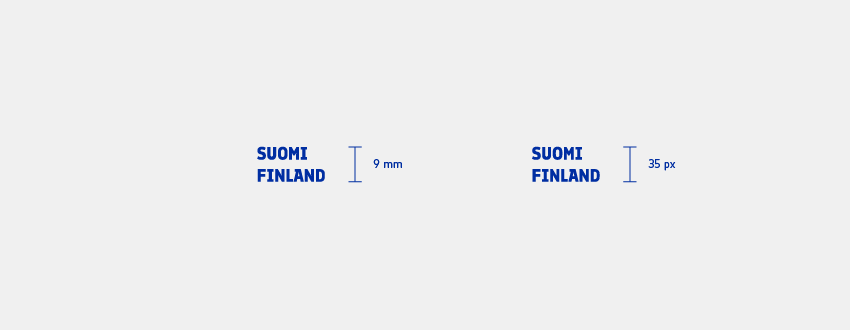
Minimum sizes
These measurements are recommended to keep the logotypes clearly recognizable in small scale use.
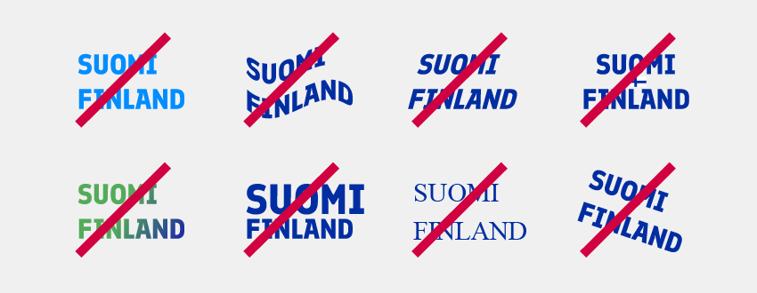
How to not do it
You should not deviate from the logotype’s carefully defined colors and proportions.
How to do it
The different color versions are made for various purposes:
1.&2. The blue version can be used on white or on top of light-toned photography.
3.&4. The white version can be used on blue or on top of dark-toned photography.
Related files
More materials are added after this section.
More materials are added after this section.
More materials are added after this section.